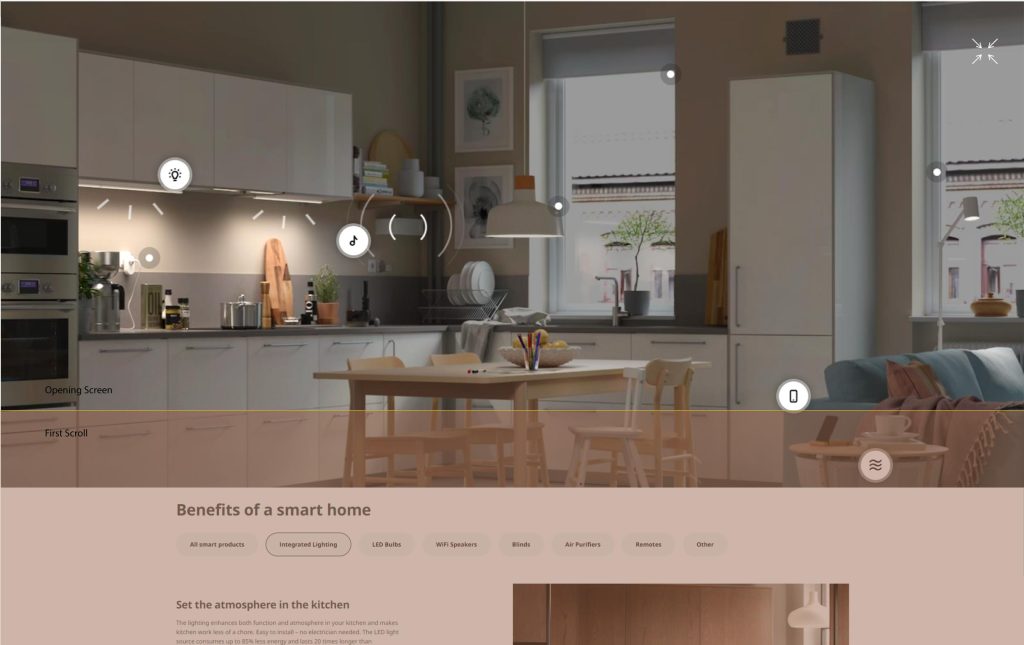
Eliminating the problem with navigation buttons, thumbnails, and icons in the HSD Scene Controller
Presenting the new layout of the: Discover the wonder of smart living page
In this case study, I address the challenge of limited visibility and excessive scrolling in Ikea’s HSD Scene Controller. By rearranging the controllers and introducing a new layout, my goal is to provide end users with a comprehensive view of the complete interactive hero image, controllers and over-image circle buttons, all accessible without the need for scrolling.
Problem Statement: The current layout of the HSD Scene Controller poses challenges in terms of limited visibility and excessive scrolling for users. It becomes difficult for them to see the complete hero image alongside all the connected circle buttons representing different products. The need for scrolling hinders the user experience, and I have the desire to showcase as much content as possible on the initial screen.
Proposed Solution:
Redesigned Layout: My solution focuses on repositioning and rearranging the controllers to minimize scrolling and maximize visibility. By implementing a new layout, I aim to showcase the complete hero image and all connected circle buttons without requiring users to scroll.
Enhanced Initial Screen: The newly designed layout ensures that upon opening my HSD Scene Controller, users can immediately view the complete hero image alongside all the connected circle buttons representing different products. This eliminates the need for scrolling and provides users with a comprehensive overview at a glance.
Strategic Placement: I position the hero image prominently in the top right of the screen, allowing it to occupy a significant portion of the available space at the left. The controllers (buttons for changing ambient and room) are strategically placed left of the hero image, ensuring their visibility and easy access for users.
- Improved Visibility: The redesigned layout allows users to see the complete hero image and all connected circle buttons without scrolling, providing a more engaging and informative experience.
- Streamlined Navigation: By minimizing scrolling, users can quickly and easily access the desired product information, reducing frustration and improving overall navigation efficiency.
- Enhanced User Experience: The new layout showcases a comprehensive view of the scene and connected buttons, giving users immediate access to relevant content and maximizing their interaction with my HSD Scene Controller.
Conclusion: By implementing a redesigned layout that emphasizes visibility and minimizes scrolling, I successfully address the challenges associated with limited visibility and excessive scrolling in my HSD Scene Controller. The solution ensures that end users can view the complete hero image alongside all connected circle buttons, providing a seamless and informative user experience from the moment they open the application.
The problem
HSD Scene Controller buttons, thumbnails, and product buttons are missing.
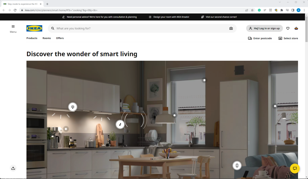
Screen layout elements: icons, buttons, thumbnails, and overlap.
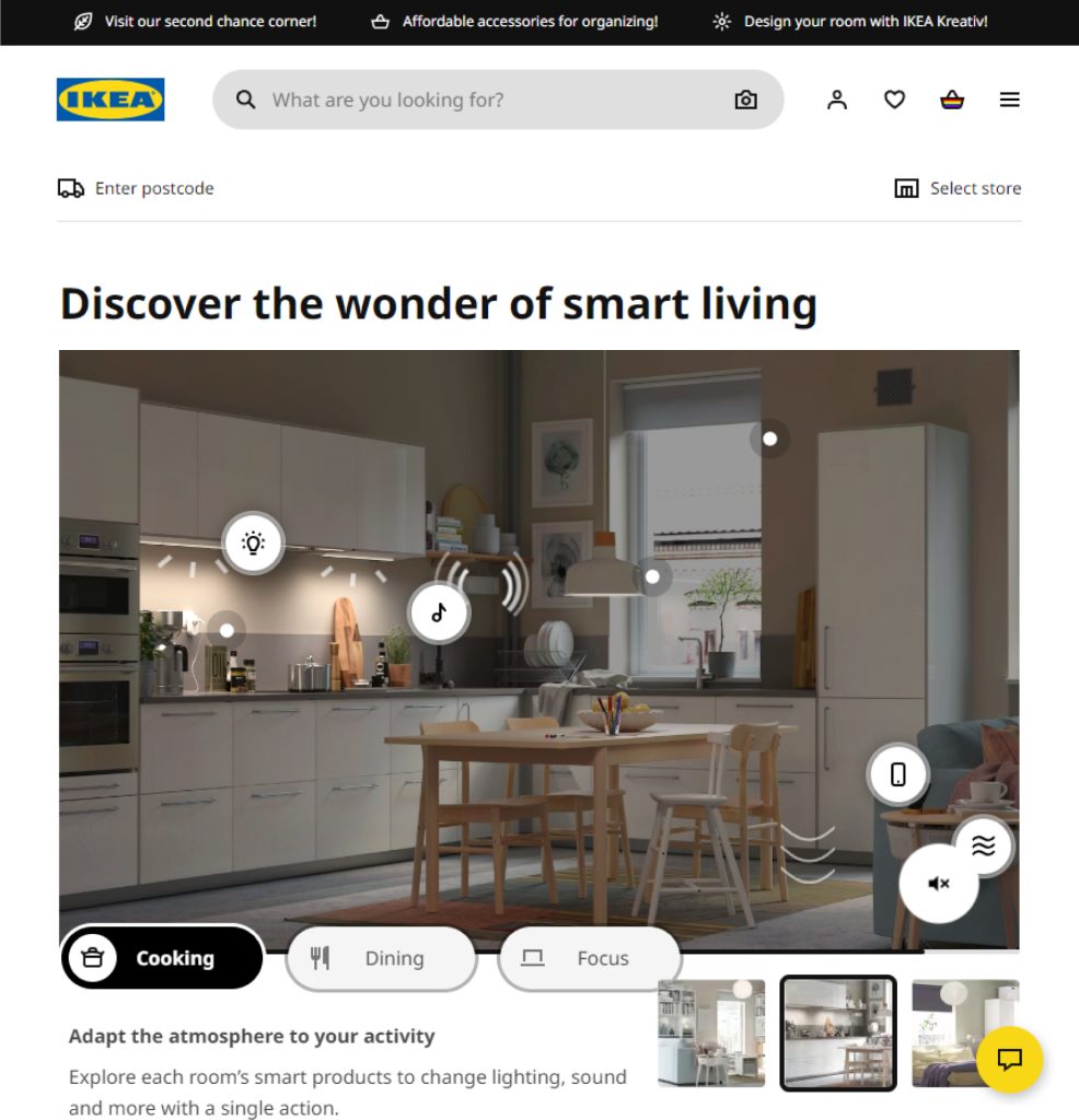
The solution
Current visible area on opening screen
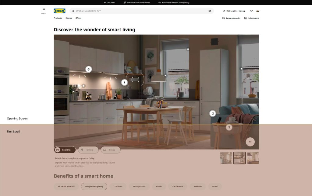
The new layout
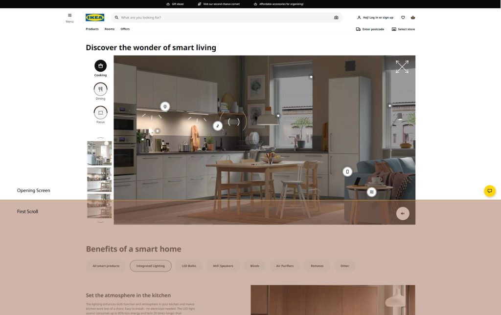
The new layout with product side bar
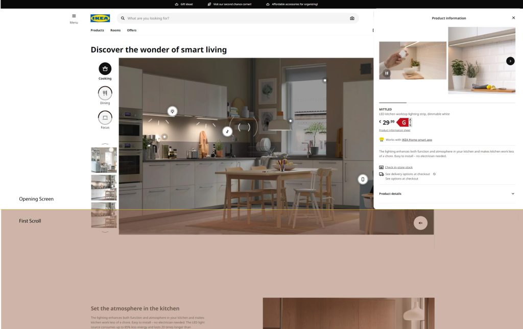
The new layout with the interactive hero image expand in full screen
